Penfluent
A stationery & art supply company required a colorful, but professional branding identity alongside their website launch.

Phase 1
The first round of design was research-based around its competitors, the service’s purpose, and visual voice. Anyone interested in art or engineering can use Penfluent. This service would really help beginning artists and do-it-yourself type of customers as it would eliminate part of the uncertainty in starting a new project. If Penfluent can simplify all that information into a language that is easy to understand, then Penfluent becomes a necessary mediator between user and supplier. Then, it was straight into the design process for me and the initial foundation of Penfluent was built.


Why Redesign? While the design part of it was… rough, to say the least, the idea of a company that specifically makes instruments for artists (and casuals) was still really strong.
Redesign Phase
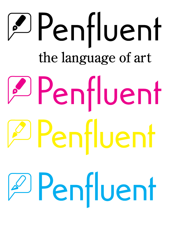
I simplified the original Logo by only using the pen icon, angled down to create a more dynamic and cohesive look while strengthening the lineweight significantly. The corners of the speech bubble and pen were rounded. To further push the pen motif and work with colors outside of my usual preference, the main color palette is composed of Cyan, Magenta, Yellow, and Black which is better known as CMYK. As there are three kinds of instruments for Penfluent, Pens, Pencils, and Tools, both the pencil icon from the original logo was changed for the new version and a new icon of an exacto knife was made to represent the Tools section of instruments. The Tagline itself was changed from “The Language of Pens” to “The Language of Art.”




Website Phase
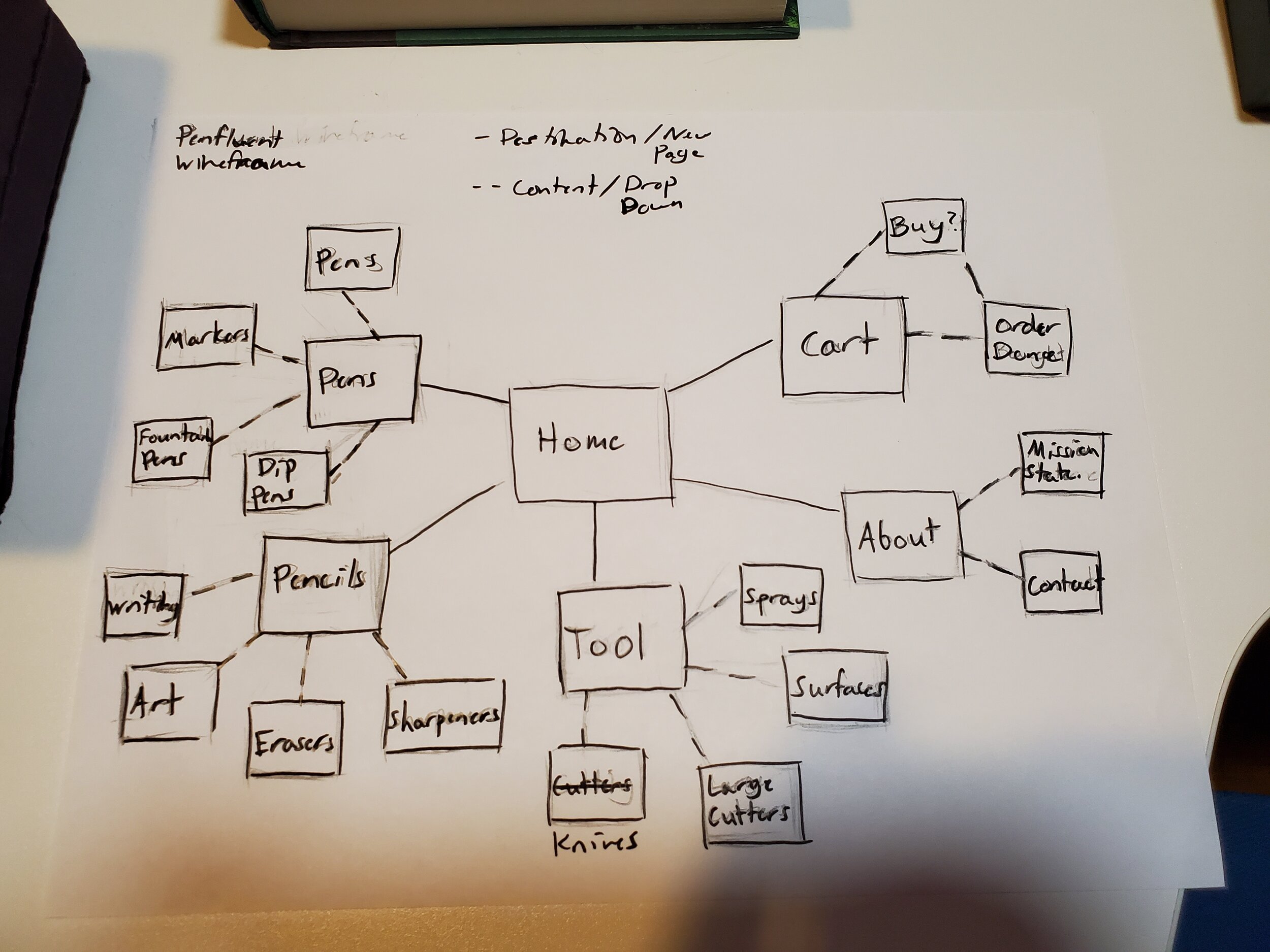
As every Website Development should start with its paths wireframed, I created a rough draft mapping out the various avenues and crucial parts of the Penfluent Website, such as: the Home page, each Product Type (Pens, Pencils, Tools), each Product Types Variety, the Cart option for online sales, and the About Page. Further research was done to understand exactly what kind of products Penfluent could sell if its goal is to help supply Artists and Engineers for their projects instead of how these products fit in a specific market. The Prototyping itself was also far more complicated in this version than the first version.


Website Demo
From the CMYK color scheme giving each section its own identity with the logo and color changing on the “Penfluent” wordmark, to the wonderful stock imagery provided by StockSnap.io, the design of the Website was the most involved part of the project.
With the Website finished for now, as there is always room for improvement, and Mockups designed for further examples of the branding system, Penfluent is a brand I hope to continue in the future.


