Chehalem Valley
Chamber of Commerce
Chehalem Valley Chamber of Commerce needed a more modern, organized brand that fit their focus on communal growth and support of local businesses.

Building the Brand
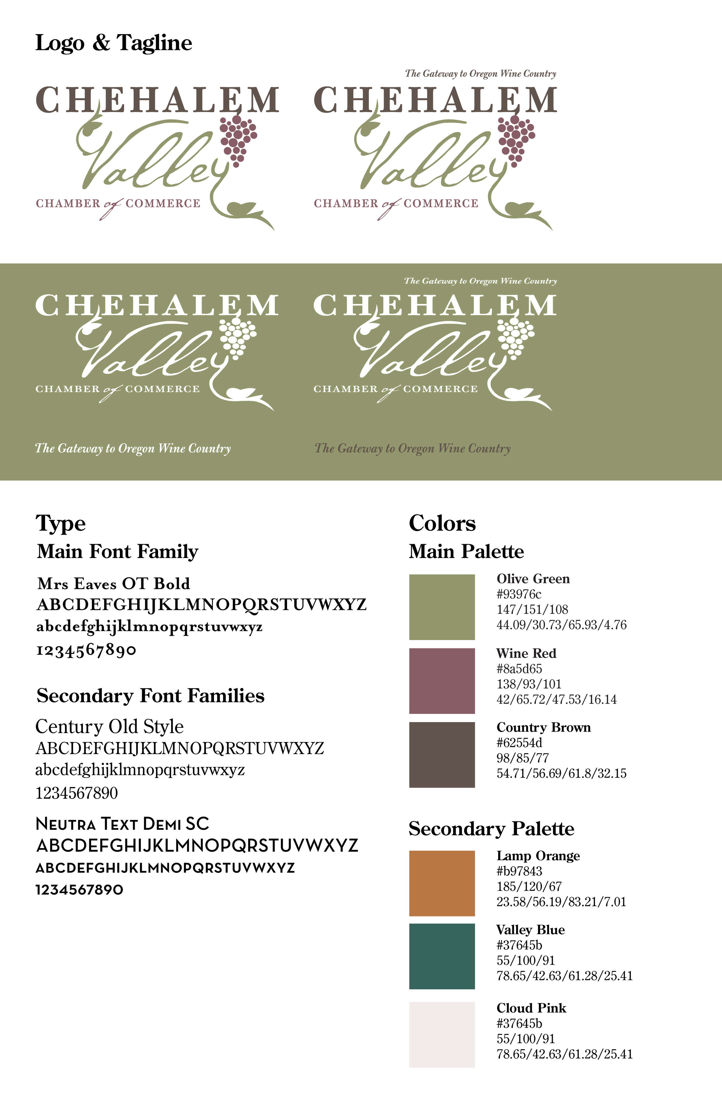
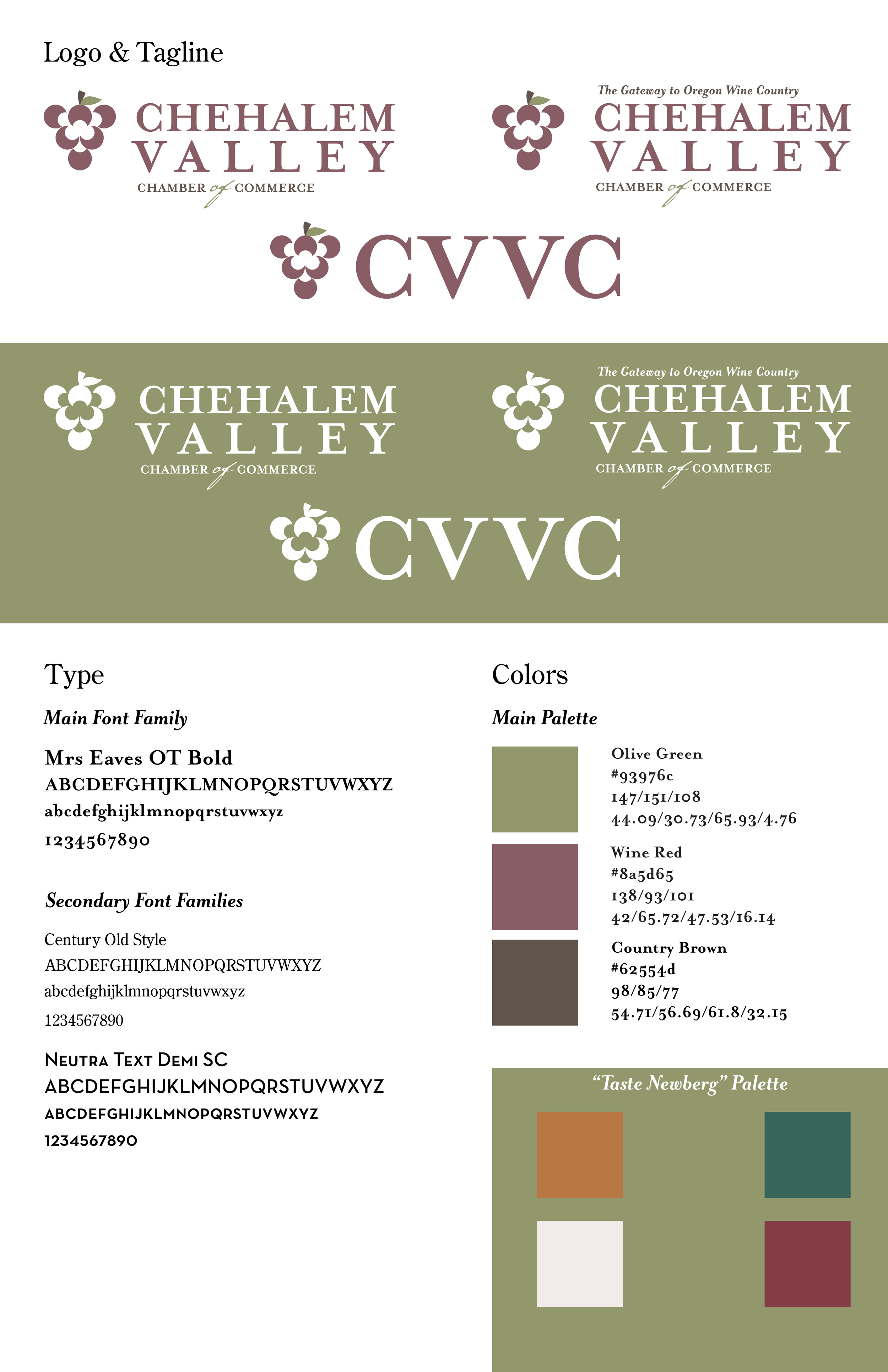
A lot of the work I am used to is creating new graphic assets, so while I have worked on rebranding hypothetically, it was a much more fulfilling experience to be directly working for someone. I started by studying the original logo, fonts, and colors through making a mock branding guide. From there, it took various stages and design drafts to get where it ended up. A lot of the logo work was of my own doing, but since the board of directors desired the original logo, I simply removed a few “grapes” that would have made it very hard to read when shrunk down.


The Brand’s Voice
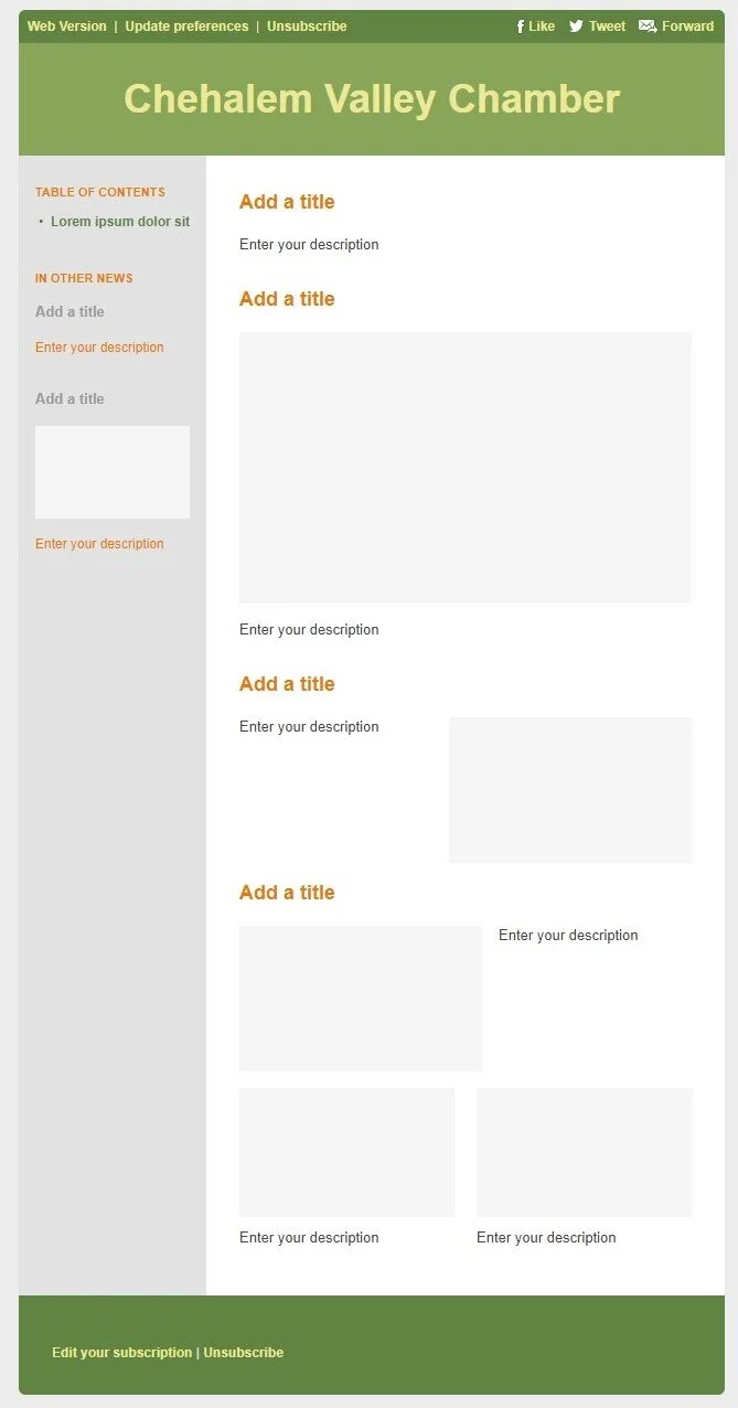
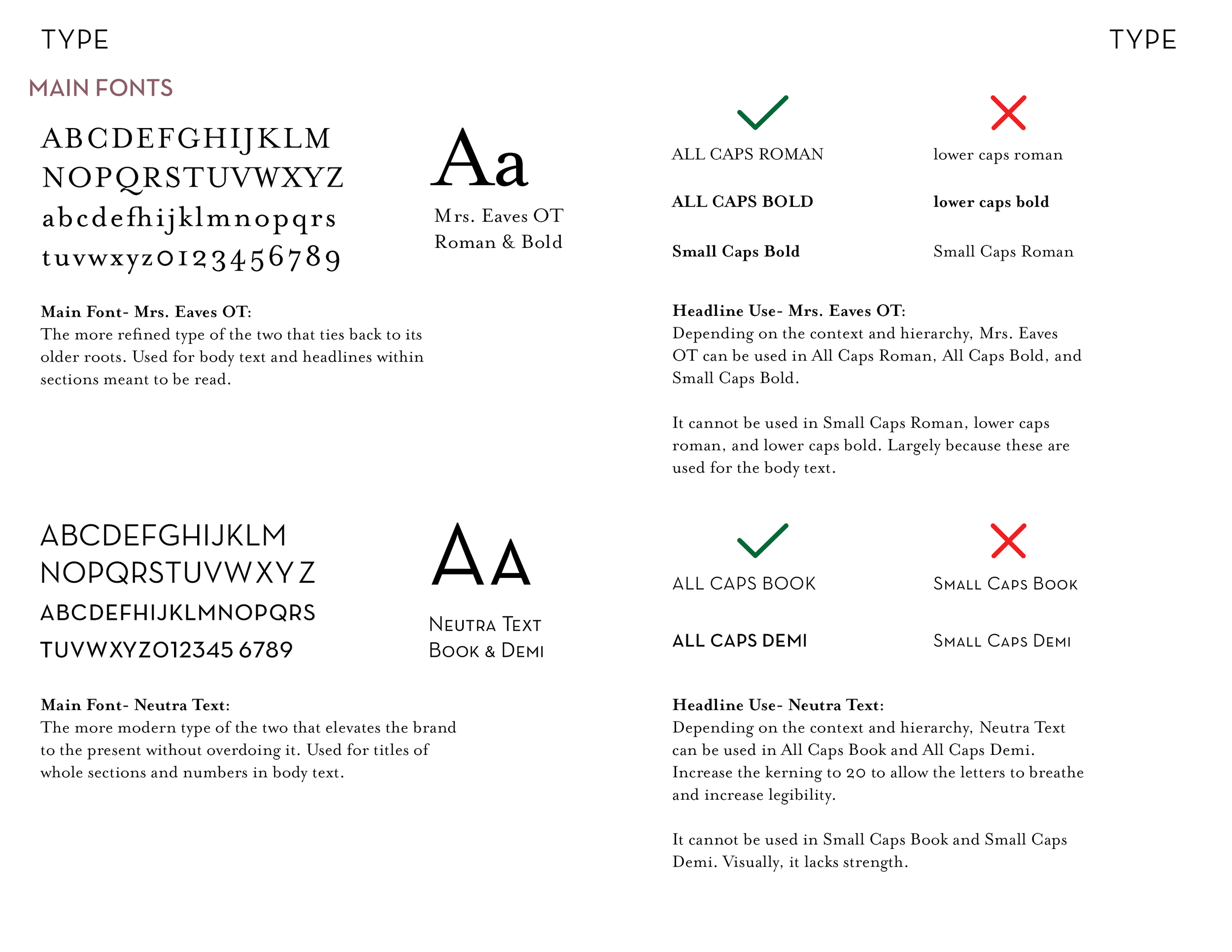
Over the course of a semester, various deliverables were requested by my supervisor. Due to the temporary nature of my position, the tasks requested of me were more relevant to their needs rather than the typical business stationary. One deliverable was developing a new template for their email newsletter. Another quick deliverable was a letterhead for the brand which was left white with minimal color usage for the best printing results. The last deliverable I worked on was the Branding Book. Knowing this position was temporary and someone else would be taking over the designs, I did not want CVCC to lose the progress made on their brand.


