Red Nose Remedy
A non-profit organization of professional Clowns that entertain children and adults alike undergoing serious treatment required a brand and stationary.

Phase 1
Because there were two possible names for the brand, our team tried working on both “Best Medicine” and “Red Nose Remedy” to get a feeling for how the brands should move forward. The initial logo designs tested the waters and presented some interesting ideas. For “Red Nose Remedy,” I went with the rather obvious Red Nose imagery associated with clowns. Later on, my professor suggested mimicking the style and typography of the “Pino Noir” logo on the Logo-Inspiration Board, while one of my teammates handled the classic red nose logo.


Phase 2
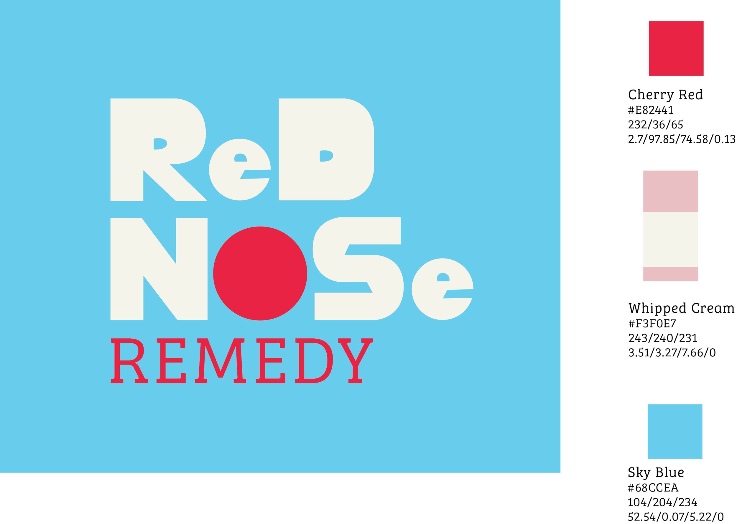
While the initial version was rough, further development of the Wordmark solidified the style and colors of the brand. A foil mockup of the logo pushed the compact nature of the Wordmark and simulated how it would look on stationary. An alternate color version was also created for variety and a less-intense color palette. In the end, the Client chose not only the name “Red Name Remedy” as the official name of the organization, but also my Wordmark design to further the style of the branding. Further refinement of the wordmark made the “Red” part smaller, the “Nose” part longer, and the kerning of the bigger words was extended to give the letters more breathing room. The “Remedy” was shrunk to give more hierarchy to the bigger words and created a more-visual afterthought.


Phase 3
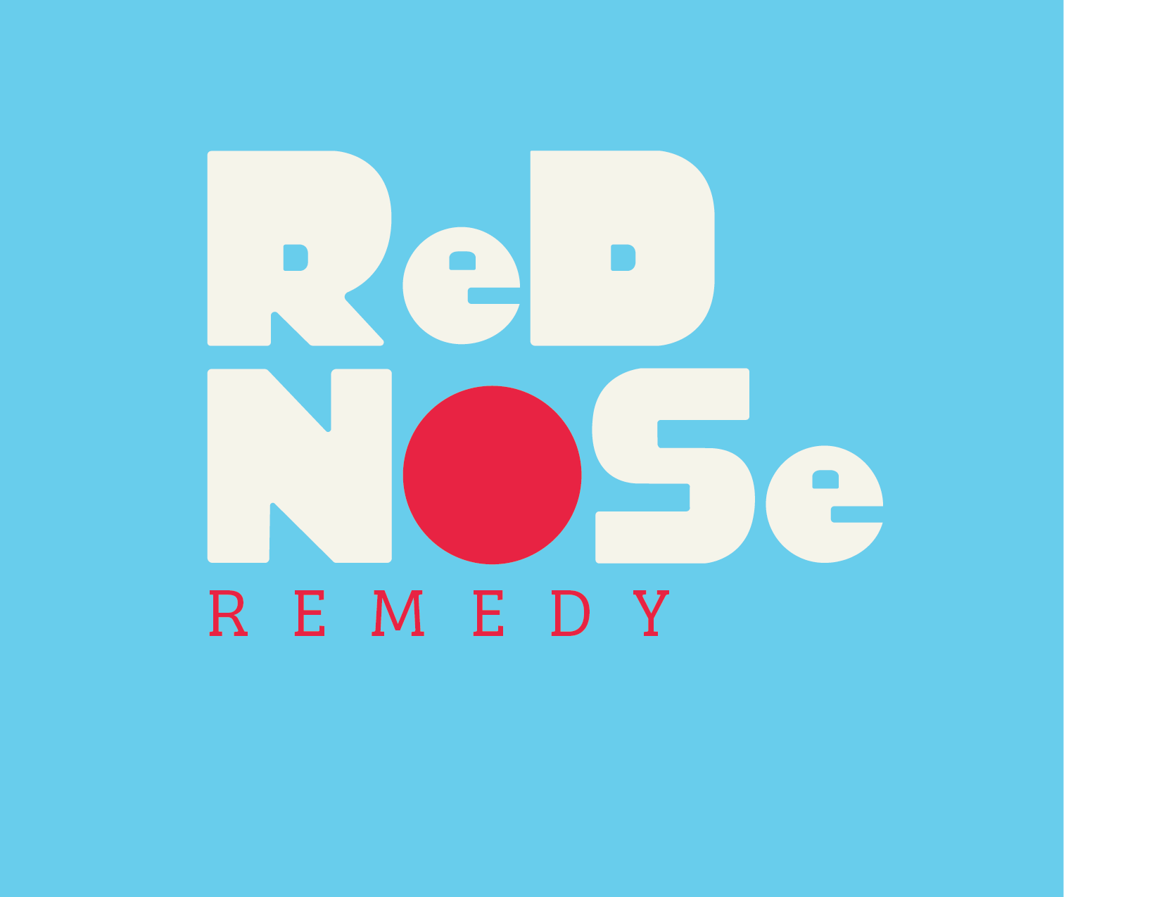
Now this is where the team aspect of this project really comes into play. While I am proud that my design was chosen and my Wordmark led the team in the right direction, it needed further refinement by someone else. Catherine Higgins, a Graphic Design-Illustration double major, refined my Wordmark further by softening the hard angles and expanding on the counters of “R,” “e,” and “D.”


The Mockups were then done by Zed Tademy and Noah Katterman, two members of our team who had been of great help since the beginning. While I worked on the Business Cards and Letterhead (Stationary), Noah worked on the t-shirt designs and Zed created a mockup of balloons with both versions of the Wordmark. With Catherine finishing up the deliverables by creating the Brand Guidelines, Red Nose Remedy was ready to take off!


